Hello all,
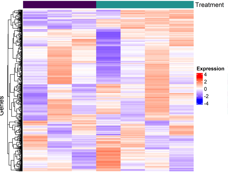
I'm new to RNASeq and bioinformatics. I'm trying to create a map of the top 500 differentially expressed genes across treatments, where I have one vehicle/control condition compared to six treatments. First, I calculated the mean expression for replicates to collapse them into a single column per condition. Next, I scaled the data and generated the heatmap.
However, I've been asked why the first column (vehicle/control) isn't entirely zero on the log fold change (logFC) expression scale. I was told that this might indicate an issue in my code, as all treatments should be normalized relative to the vehicle/control condition. Where the first column should then look all white (or at 0).
I seem to be lacking understanding in this area. Any input would be appreciated,
dds <- DESeqDataSetFromTximport(txi, colData = sampleTable,~Condition-1)

dds <- DESeq(dds)

keep <- rowSums(counts(dds)) >= 1
dds <- dds[keep,]
rld <- rlog(dds, blind = FALSE)

data.frame(assay(rld))

rld.df <- data.frame(assay(rld))

rld.collapsed  <- t(apply(rld.df, 1, function(row) c(mean(row[1:3]), mean(row[4:6]), mean(row[7:9]),mean(row[10:12]),mean(row[13:15]),mean(row[16:18]),mean(row[19:21]),mean(row[22:24]) )))

colnames(rld.df)


colnames(rld.collapsed)  <- c("Veh_1d", "Treatment_1_1d", "Treatment_2_1d", "Treatment_3_1d",
                         "Treatment_4_1d", "Treatment_5_1d", "Treatment_6_1d", "Treatment_7_1d")


top_500_sig_genes <- rownames(res_ord_padj)[1:500]
data.frame(top_500_sig_genes)


selected_conditions <- c("Veh_1d", "Treatment_1_1d", "Treatment_2_1d", "Treatment_3_1d",
                         "Treatment_4_1d", "Treatment_5_1d", "Treatment_6_1d")

cellLine <- list(c())

rld_heatmap <- rld_collapsed_obj[, colData(rld_collapsed_obj)$Condition %in% selected_conditions]

mat <- assay(rld_heatmap)[top_500_sig_genes, ]


mat_scaled <- t(apply(mat, 1, scale))


colnames(mat_scaled) <- colnames(assay(rld_heatmap))


cols <- colorRamp2(c(-3, 0, 3), c("blue", "white", "red"))


ha <- HeatmapAnnotation(
  Treatment = as.factor(colData(rld_heatmap)$Condition),
  col = list(Treatment = c(
    "Veh_1d" = "#440154ff",
    "Treatment_1_1d" = "#440154ff",
    "Treatment_2_1d" = "#440154ff",
    "Treatment_3_1d" = "#440154ff",
    "Treatment_4_1d" = "#21908dff",
    "Treatment_5_1d" = "#21908dff",
    "Treatment_6_1d" = "#21908dff"
  )),
  show_legend = TRUE
)


ht <- Heatmap(
  mat_scaled,
  name = "Expression",
  col = cols,
  top_annotation = ha,
  show_row_names = FALSE,
  show_column_names = TRUE,
  column_names_rot = 45,
  cluster_rows = TRUE,
  cluster_columns = FALSE,
)


ppi=500
png(paste0(figures, "heatmap_DEG_top500_", ".png"), width=7.5*ppi, height=6*ppi, res=ppi)
draw(ht, row_title = "Genes", column_title = "Day 1 Vehicle vs. Treatments")
dev.off()


